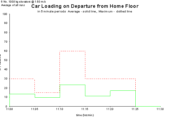
Car Loading on Departure from Home Floor shows how full the cars are at the beginning of a round trip. This is particularly relevant during up-peak traffic. The lower line represents the average loading in each five-minute interval, while the upper line shows the highest loading during the same interval.
You can view this graph for any individual run or for the average of all runs.
The right-hand side y-axis (persons) is only displayed when Elevate determines that all cars have the same capacity and all passengers have the same mass.
For double-deck cars, the plot refers to the loading of the lower car only.
Was this article helpful?
That’s Great!
Thank you for your feedback
Sorry! We couldn't be helpful
Thank you for your feedback
Feedback sent
We appreciate your effort and will try to fix the article