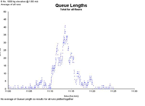
Queue Lengths shows the number of people waiting at elevator landings over time. This is displayed as a scatter diagram, where a new point is plotted each time the queue length changes.
- Plot Types:You can plot the queue lengths:
- For a specific floor
- For all floors combined (representing the total number of people queuing across all elevator landings)
- Simulation Runs:This graph can be generated for:
- Any single simulation run
- An average across all runs
- Average of All Runs: If selected, queue lengths from each run are overlaid using different colours, allowing visual comparison.
Example Queue Lengths graph:
Was this article helpful?
That’s Great!
Thank you for your feedback
Sorry! We couldn't be helpful
Thank you for your feedback
Feedback sent
We appreciate your effort and will try to fix the article