Elevate will plot a wide range of graphs, depending on the boxes ticked in the Report Options table. You can also choose to display graphs in black and white or in colour.
For more detailed insight into the simulation results graphs, please refer to the Viewing the Results section. By default, graphs are auto-scaled. To set custom axes, select the Scale tab.
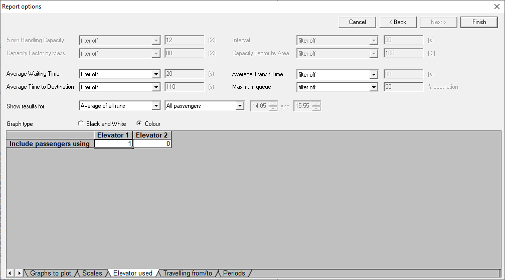
To analyse results for passengers using specific elevators, use the Elevator Used tab. Set 1 to include and 0 to exclude each elevator. For example, to analyse passengers using only Elevator 1, set Elevator 1 to 1 and all others to 0.
The following example would include results for passengers using Elevator 1.
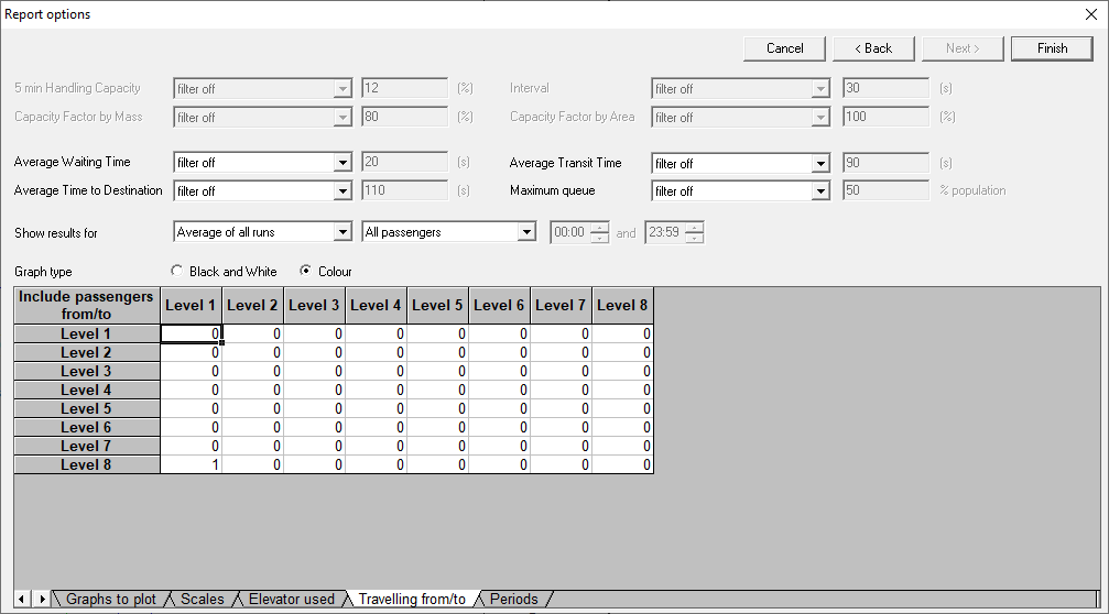
A typical use for this would be if a single destination control group was serving high and low rise traffic; using this option would allow consideration of the low and high rise lift service separately.
For analysis restricted to specific journeys, use the Travelling From/To tab. Set 1 for desired origin-destination pairs and 0 for others. For example, if you wanted an analysis of only passengers travelling from level 8 to level 1, configure the table as follows.
A typical use case for this would be evaluating waiting times at the basement floor when only one elevator serves it.
Was this article helpful?
That’s Great!
Thank you for your feedback
Sorry! We couldn't be helpful
Thank you for your feedback
Feedback sent
We appreciate your effort and will try to fix the article