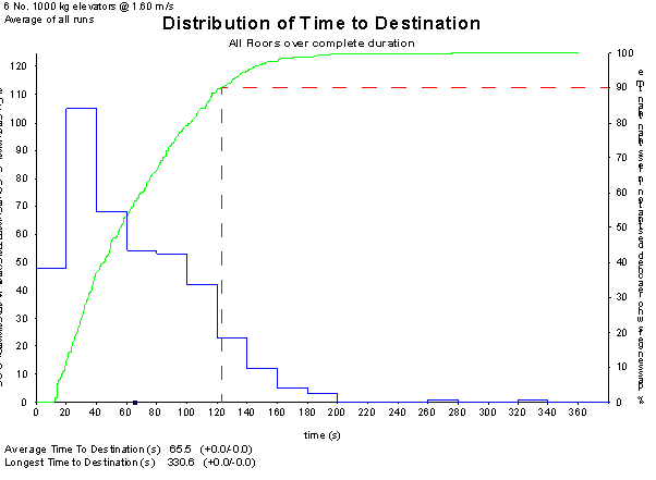
Time to Destination is defined as the sum of the Passenger Waiting Time and the Passenger Transit Time. Elevate uses this measure to compute both the Average Journey Time and the Longest Journey Time.
Elevate displays this data in a graph with two key views:
- Right-hand Y axis (Percentage): Shows the cumulative percentage of passengers with a Time to Destination less than or equal to the X-axis value. A dotted line marks the 90th percentile.
- Left-hand Y axis (Passenger Count): Shows the number of passengers whose Time to Destination falls within each defined time range (i.e. a histogram).
Additional metrics provided by Elevate include:
- Average Time to Destination
- Longest Time to Destination
- Range of Results (if multiple simulations): When more than one simulation is run per configuration, Elevate reports an average result along with the range, e.g. 45.3 (+4.2 / -2.8).
Was this article helpful?
That’s Great!
Thank you for your feedback
Sorry! We couldn't be helpful
Thank you for your feedback
Feedback sent
We appreciate your effort and will try to fix the article